A New Identity
Guardian began the process by conducting a brand audit, engaging in a thorough analysis of the current brand strength, the competitive landscape, situational context, alignment and misalignment of message, and resonance with audiences and key stakeholders.
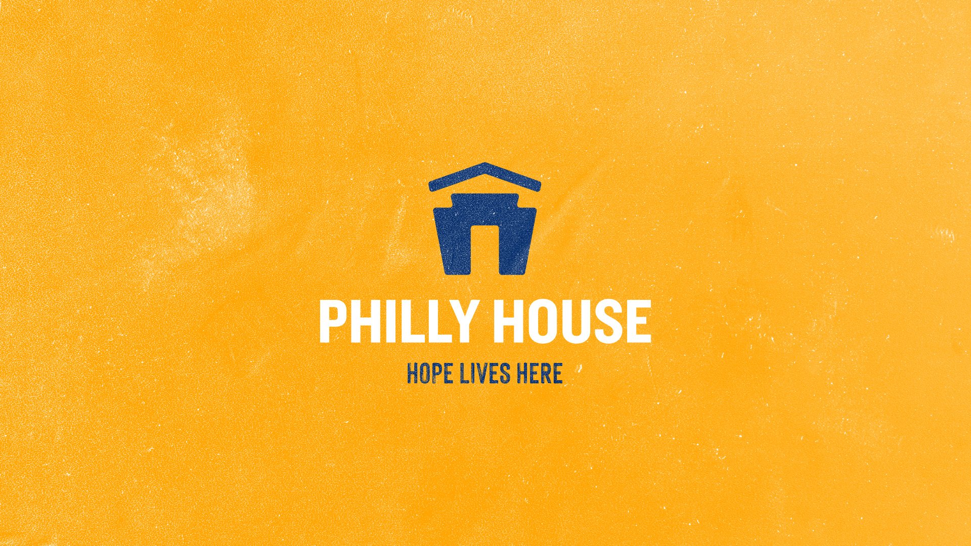
From there, the team concepted a new name: Philly House. “Philly,” an insider’s reference to its historic sense of place and missional calling. “House,” the image of a welcoming, safe, refuge from the streets for the homeless, hungry and hurting—a place that treats everyone like family.
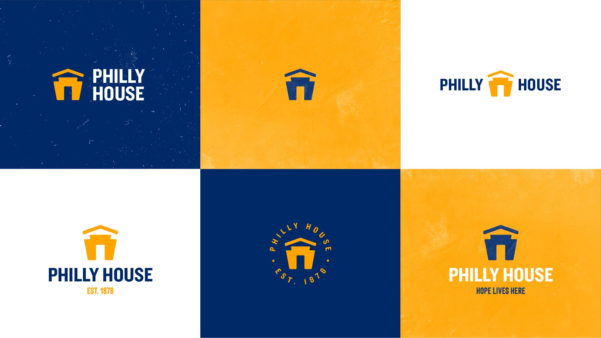
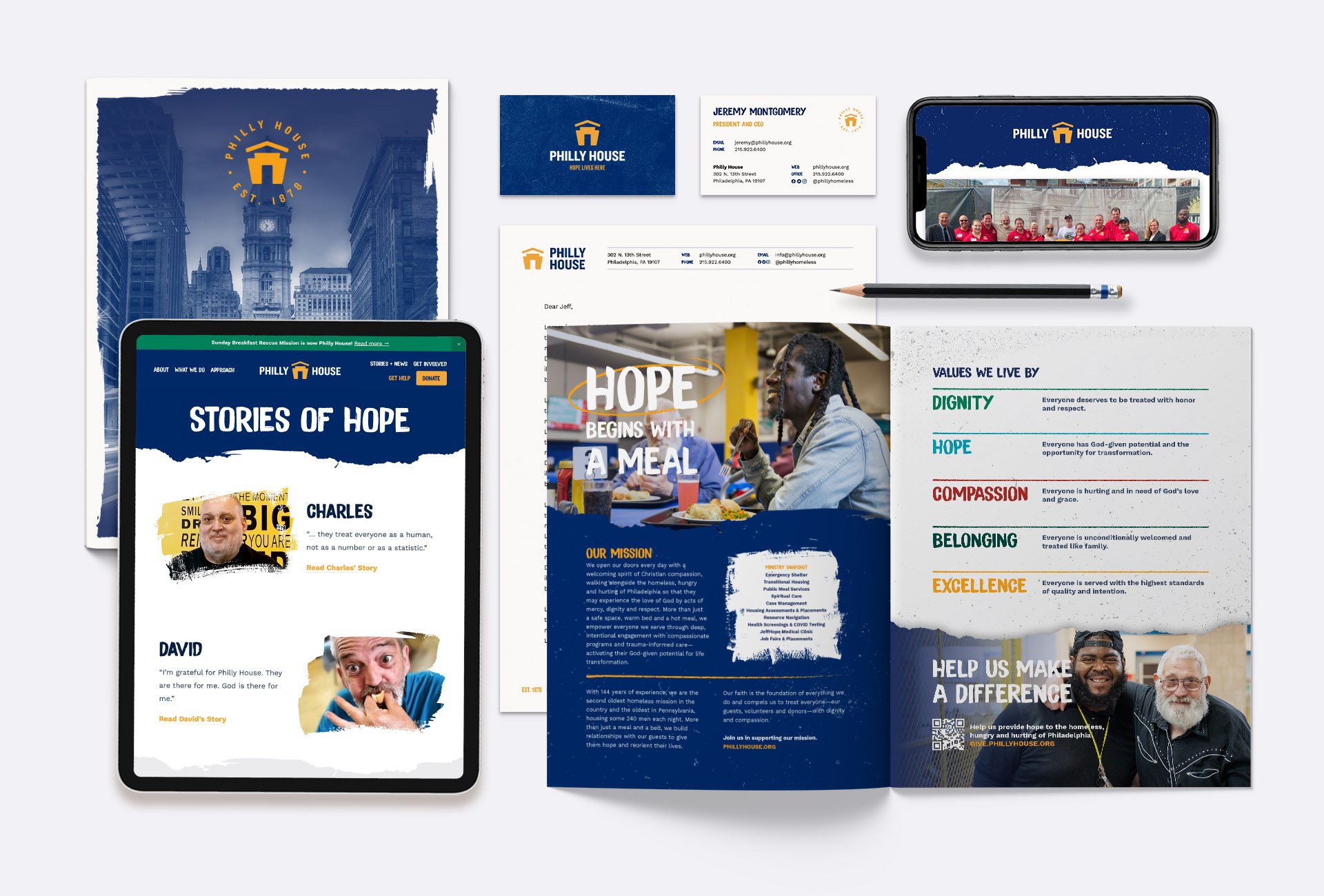
Along with the name, a new visual brand identity—including a fresh logo, color palette and suite of fonts—was developed to anchor the brand DNA into the mind of the viewer through symbolism and beauty.
As the name, messaging and visual identities were solidified with the rescue mission leadership, the Guardian team brought the brand to life with physical resources (brochures and signage) as well as digital elements (email newsletter templates, website mockups, templates for business cards and letterhead.


